
What’s Behind Thankyou Payroll’s New Look and Feel?
You may have noticed that things are looking a little different in the world of Thankyou Payroll. It’s all good things, don’t worry – let us explain.
If you haven’t heard the news already, today is the official launch day of Thankyou Payroll’s fresh, new look and feel.
It’s been a long and exciting journey to get here, and we’re thrilled to finally share our refreshed identity with the people who matter most – our customers.
Last week, we took you on this brand refresh journey through a series of blogs – you can catch up on these over on our blog.
Today, with every last good thing out in the open, we’re here to explain what all of these new symbols, colours, and words mean – for Thankyou Payroll, and for you.
Our why – a quick reminder
If you’re familiar with our brand refresh journey, you’ll know that this project has always been much more than just some pretty colours and a new logo.
We embarked on this journey with a mission to modernise, mature, and provide longevity to Thankyou Payroll.
Through conversations with our customers and some deep digging with our team, we got to the core of who Thankyou Payroll is. It was just a matter of translating the same sense of connection, compassion, expertise, and professionalism embedded in our identity, into the way we presented ourselves to you.
The look & feel we’re revealing to you today tells this story – it’s a balanced dance between heavy and light, fun and serious. We hope you love it as much as we do.
The logo
Let’s start with the explanation you’ve all been waiting for – our new logo.
Thankyou Payroll’s former logo will forever hold an important place in our history, but over a decade on, we have outgrown what it once represented to us.
It’s no easy task trying to encapsulate everything Thankyou Payroll represents in one simple symbol. But, with a little help from our friends at Studio Acht, we think we’ve done just that – and we couldn’t be happier with the result.
It’s simple, it’s clean, and it’s professional – but how does it reflect Thankyou Payroll?
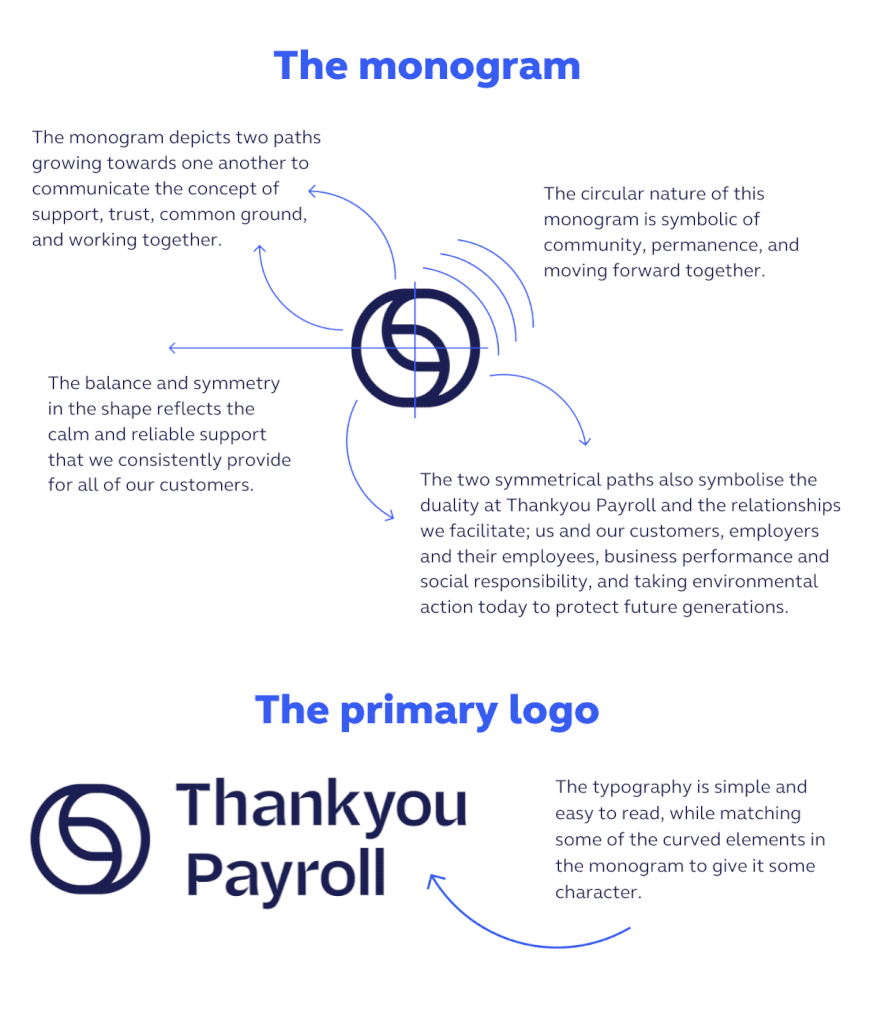
The graphic elements
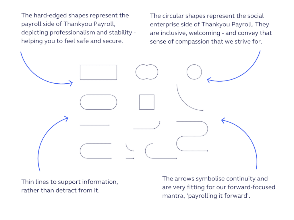
The graphic devices we have chosen add another layer of individuality to our look and feel. They support our messaging, helping to keep it clear, concise, and forward moving. We think they look good too.
We have introduced a combination of round and square-shaped devices, as well as a series of different arrows. Here’s why…
The colour palette
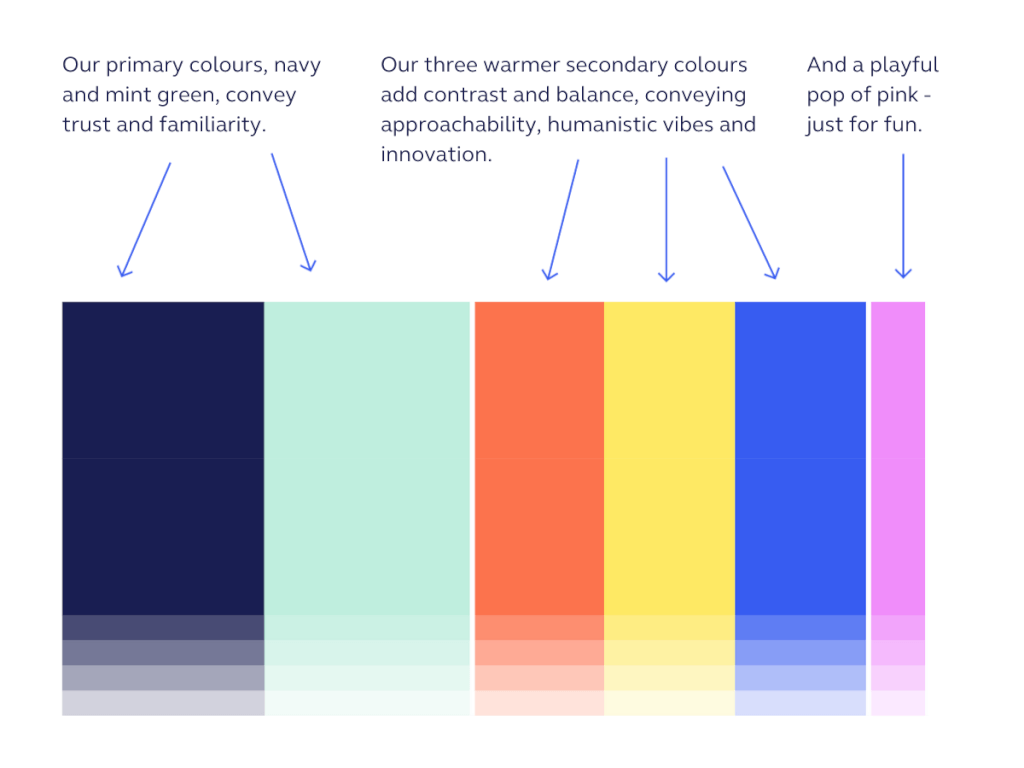
From the very beginning, we knew we wanted to be bold, colourful and out of the box – because that’s who we are and who we have been for the last 13 years. However, we didn’t want to stray too far from the trust and reliability that the ‘blue finance space’ conveys. We look after your money and we want you to know that we don’t take this responsibility lightly – first and foremost. As always, it was all about finding a balance.
The use of photography
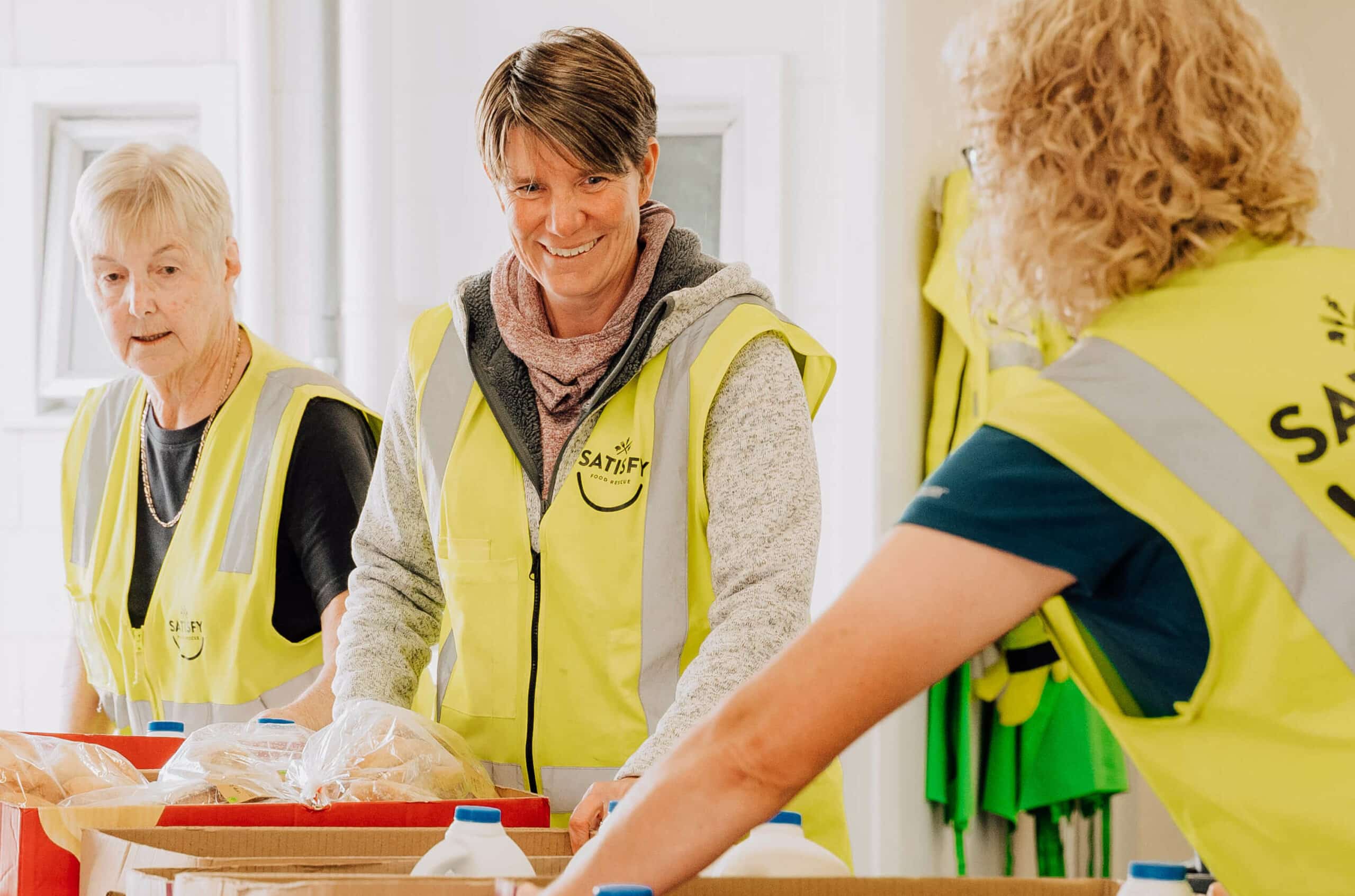
Forming meaningful, long-term relationships with our customers is a big part of who we are. We wanted to bring this to the forefront, showcasing the amazing people who put the purpose in our payroll service. We also want you to know that there are real people behind what we do who have your back.
That’s why, you’ll be seeing a lot more of you, and a lot more of us from now on.
Our fonts
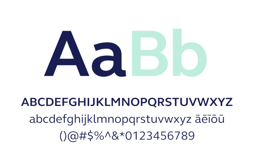
As far as fonts were concerned, we wanted two things: simplicity and accessibility. While there are a lot of fancy fonts out there, our main priority was to be able to communicate with you in a way that is clear and inclusive.
This led us to choose Elliot Pro as our main typeface. It’s a modern sans serif that’s friendly and easy to read due to its open letter forms, clear shapes and gentle curves. Most importantly, Elliot Pro includes all macrons needed to communicate using te reo Māori.
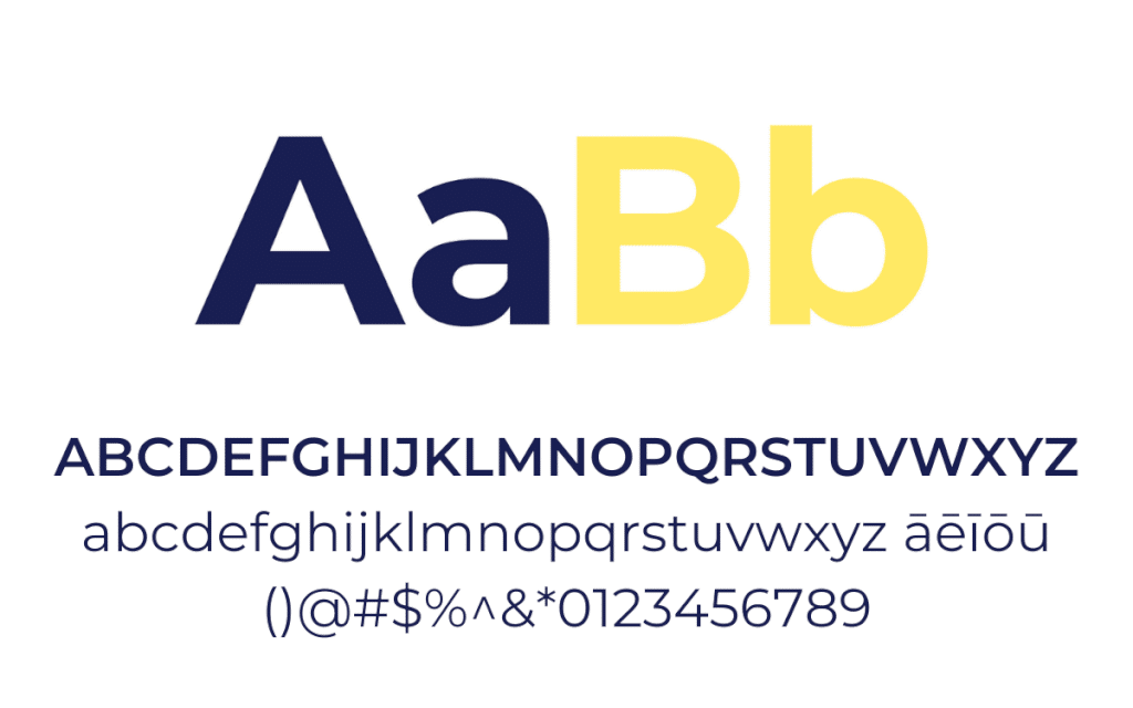
Montserrat is our complementary typeface – you’ll mainly see this when you interact with us on the web or on our app. It’s a clean, versatile typeface that has geometric bowls and curves – similar to Elliot Pro. Montserrat also includes all of the Māori macrons.
A journey not a destination
You’ve likely noticed that our refreshed look and feel has already sunk its roots into our website, social media, and emails.
We’d like to remind you that the changes you see on the surface of Thankyou Payroll today are setting the tone for further modernisation in the product – with the first set of improvements due to be released in the coming months.
Rest assured, we’ll let you know as and when these changes roll out – keeping you in the loop is our number one priority.
For now, we’d like to thank you all for being a part of our journey so far. We’re beyond excited for the good things this new look and feel will bring to the Thankyou Payroll community – we hope you are too.
